

This post was originally from designadobe.wordpress.com, a website created for a basics to WordPress and Joomla course at Chestnut Hill College, PA.
When working with text in InDesign it is important to remember margins throughout your work. Margins allow separation between different text boxes and columns. And for me as a layout designer there are a few shortcuts and rules of thumb that come in handy.
PAGE MARGINS
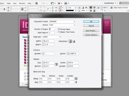
For me remembering to set up my page margins is difficult especially when you are initially setting up the document. The New Document frame (below), gives you the option in the second to the bottom section labeled Margins. If you want different margins for each side, remember to unclick the little link button in the center of the section.
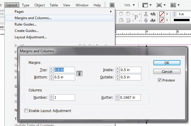
If you forget to set your page margins in the initial document set up you can always go to Layout > Margins and Columns to set up your margins, and columns for the page. Please, note though that this will only be applicable to the page you are currently on. Below is the screen that will pop up after you use the menu bar to navigate to the margins and column.
For printing reasons I suggest never going below 0.25″ when setting up margins.
COLUMNS
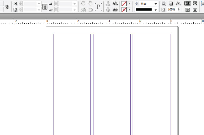
In the initial new document frame and also if you go to Layout > Margins and Columns you can also specify the amount of columns you would like. Columns are important if you are doing a newsletter or setting up a newspaper because they can space out the text or add a break in the text. I suggest using 2 or 3 columns for a newsletter, and at least 5 columns for a newspaper. To change the column amount make sure to just specify the amount of columns in the column sections of the frames above. A 3 column set up will look like this:
CREATING TEXT BOXES
To make your document look good if you are making a newsletter you most likely will have text. To add create a text box for your document, just click the “T” on the tool bar for the Type Tool. Then take your curser, click, and then drag for your text box.
To make a custom text box view my previous tutorial here.
TEXT FRAME OPTIONS
Once you create a text box there are several helpful options that you can access to format the box. To access these options go to Object > Text Frame Options. A screen like below will appear.
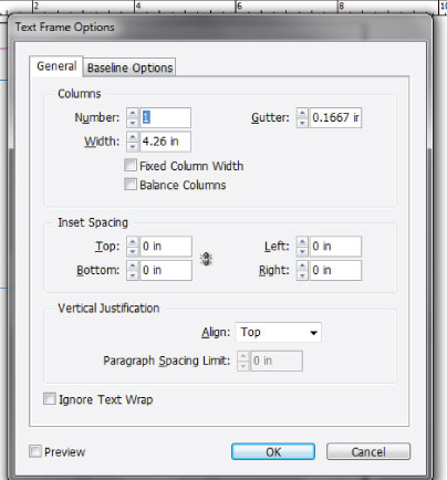
Within this screen you have three sections: Columns, Inset Spacing, and Vertical Justification.
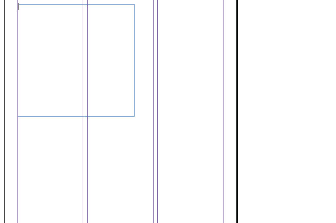
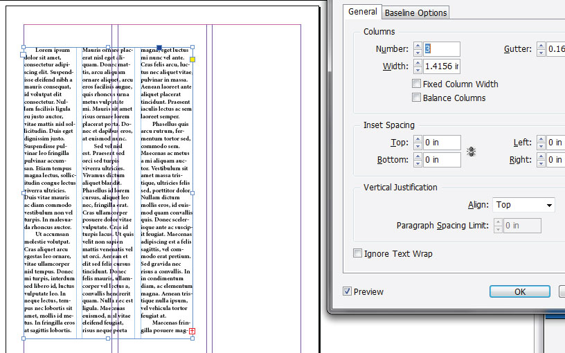
Columns here are completely different than the columns of the document. With this option your columns can be a completely different width and have different gutter spacing. To change the width and gutter, just type in sizes to the boxes next to their names. Below is an example of a text box off set from the three columns, the text box has 3 columns of its own, with a width of 1.6″, and a gutter of 0.5″.
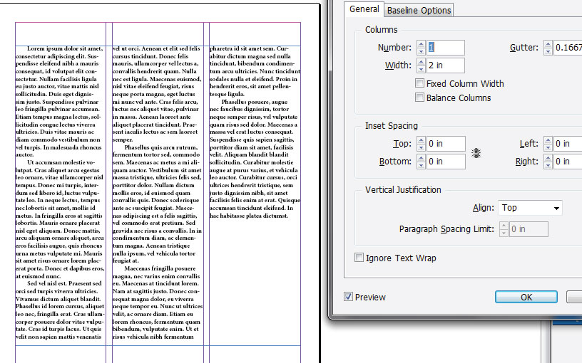
You can also align the text box to the columns and keep the default settings to make a text box that will flow for each column. Here is an example:
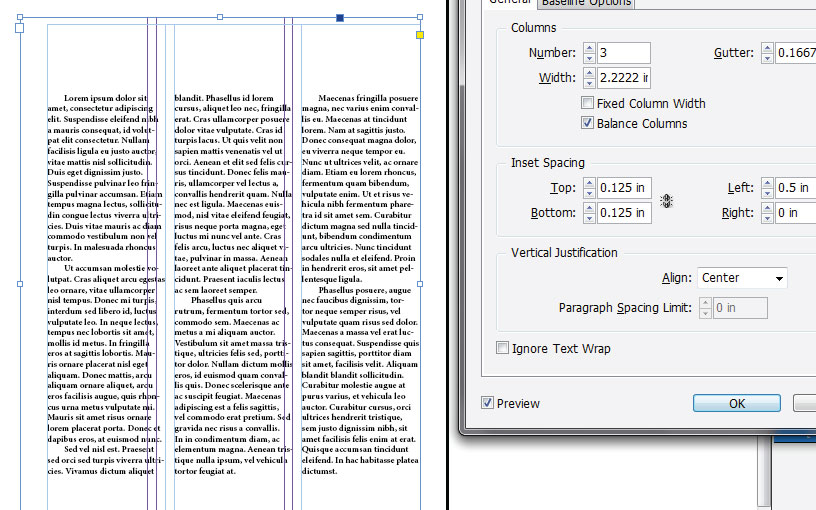
Along with the column options is also an inset option, which allows you to add a border internally around the text. Typically a 0.125″ inset is suggested. As well in the text options box under vertical justification, you can change the text so that it is aligned to the top, bottom, or center of the text box. Above shows the text box aligned to the top, below shows an inset and it vertically centered. It also shows all of the columns being balanced. To balance a column just check of “Balance Columns” in the columns section this allows all of the columns to be about the same length.
Between page margins, columns, and text frame options designers have a lot of options when it comes to adding space to their designs. As a rule of thumb when designing a newsletter or newspaper always remember to use these options, they make your life much easier.
The next tutorial here at Design Adobe will be covering Spacing the Text! Check it out, it will be out sometime this weekend.
For more information on the subject of margins and spacing here are a few tutorials: