

This post was originally from designadobe.wordpress.com, a website created for a basics to WordPress and Joomla course at Chestnut Hill College, PA.
The Adobe Suite is a powerful tool, and within the suite there are tools that are applicable in several of the programs. Today I would like to talk about Formatting Text, which along with the Type Tool is a universal application in InDesign, Photoshop, and Illustrator. To format text you have several options and functions. These functions are imperative to making your text look good but also fit within the required space you need. All of the functions I will talk about today are located in the Character Window, which allows you to format text.
ACCESSING THE CHARACTER WINDOW
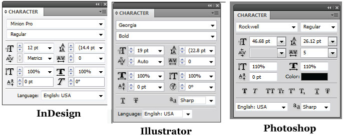
To access the character window for each program go to the Window Tab on the Menu Bar. In Photoshop just click Window > Character, Illustrator Window > Type > Character, and InDesign go to Window > Type & Tables > Character.
These functions are also available when using the Type Tool and are located in the dock right below the Menu Bar.

MAIN FUNCTIONS EXPLAINED
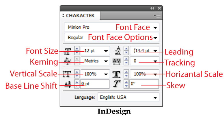
Font Face: To choose the font you would likely use the Font Face selection on the Character Menu. This allows you to choose which font you would like to use, such a Minion Pro, which is currently selected in the InDesign photo above, or Rockwell which is in the Photoshop image below. Font Faces have many different styles, the main two are Sans Serif (no feet, like the font I’m currently using here) or Serif (which has feet). Along with those two there are also handwriting fonts, gothic fonts, techno fonts, etc. I typically gather my fonts from dafont.com, it’s a great source and is easy to navigate.
Font Face Options: To get your font to be bold, italic, underline, etc. you use the Font Face Options. Fonts do come programmed with these options but will vary from font to font. Many handwriting fonts only offer one setting which is normal, while a font like Arial offers almost 10 options.
Font Size: Font Sizes will range from 1 to over 1,000 points; the font size is up to you!
Leading: The space between one line of font and another is called Leading. This is typically predetermined by the font, however sometimes you need to more space or even need to add more space to make your project look good. This is where you would also come to make your Photoshop, Illustrator, or InDesign file look like it’s double spaced, to achieve double spacing just multiple your font size by 2.

Kerning: A process for adding or subtracting space between specific characters is called Kerning. To achieve Kerning you must place your curser between the two letters in which you would like to kern. And then type in a positive or negative number to the selection area. Adobe explains that there are certain letters that automatically kern:
You can automatically kern type using metrics kerning or optical kerning. Metrics kerning uses kern pairs, which are included with most fonts. Kern pairs contain information about the spacing of specific pairs of letters. Some of these are: LA, P., To, Tr, Ta, Tu, Te, Ty, Wa, WA, We, Wo, Ya, and Yo.
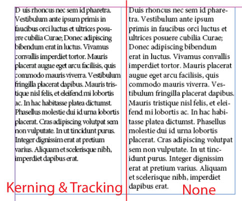
Tracking: To loosen or tighten the amount of space between letters you can use Tracking. Tracking is similar to kerning but it adjusts the space between the letters of every letter you select. Kerning is done one by one. To add tracking just either make the number in the tracking box positive (more space) or negative (less space).
Here is an example of a paragraph, the left one has kerning and tracking, the other does not:
Here’s an additional quick Adobe tutorial on Kerning and Tracking.
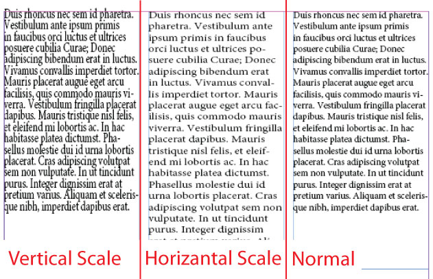
Vertical Scale: Vertical Scale changes the height of the font, to do this you must change the percentage from 100% (normal) to another number. So 90% will result in a small height, while 150% will have a larger height, enter these numbers into the box next to the Vertical Scale icon.
Horizontal Scale: The width of the font changes when you use the Horizontal Scale. Like the the vertical this option is measured in percentages, 100% is normal, 90% is a smaller width, and 150% is a larger width.
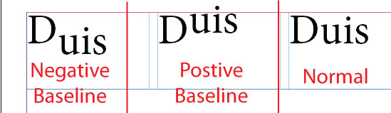
Baseline Shift: The Baseline Shift, enables users of InDesign and other programs to create basically their own Subscript (negative) and Superscript (positive). To do this either enter negative or positive numbers into the Baseline Shift box. Below is an example of what happens.
SPECIALIZED FUNCTIONS
Sometimes each of the programs have special functions here are those functions explained.
INDESIGN
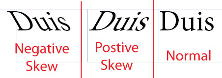
Skew: Sometimes fonts do not offer an Italics Font Face Option which means you need to create it yourself. In InDesign this can be done through Skew. To make a font look italicized it depends on the font size, but typically ten degrees makes it look that way. Skews can go either to the left (negative) or to the right (positive), and depend on the fonts themselves. Here is an example of a thirty degree skew:
ILLUSTRATOR
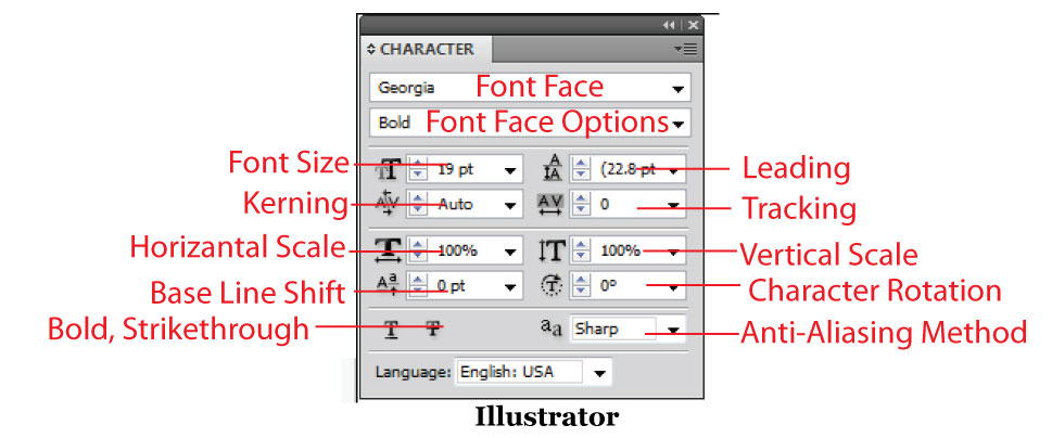
Character Rotation: Character Rotation basically rotates the characters used for your type. This function however only works negatively turning the text around. Here is an example of a negative ninety degree character rotation.
Bold, Strikethrough: The bold and strikethrough functions allow you to add their respective name’s function to the text to create different effects. The Bold will make the text bold if it is not a font face option, and strikethrough will add a line through the text.
Anti-Aliasing (ALSO PHOTOSHOP): This function allows users to smooth the edges of an object or text. Anti-Aliasing is helpful if the text you select does not have the greatest edges. Here is a tutorial on Anti-Aliasing from Adobe.
PHOTOSHOP
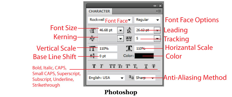
Color: The Color option of Photoshop allows you to set the color of your font within the character menu.
Bold, Italic, CAPS, Small CAPS, Superscript, Subscript, Underline & Strikethrough: These functions allow you to add their respective name’s function to the text to create different effects. For example the strikethrough adds a line through the text, caps makes all of the text capitalized, and underline adds a line under the text. These are all common features in many different programs. However, Photoshop gives you the options right on the Character window.
Next week I will be focusing on formatting the paragraph, which in addition to formatting text are some of the most important things you should know about in InDesign and in Illustrator / Photoshop.
Here are some helpful tutorials about formatting text: